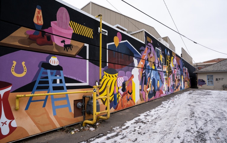
Graphic

Art that uses flat tones of colour and sharp edges.  The image gives the idea or concept of something without having to draw or paint every detail.  May be designed using graphic design software, but not necessarily.

  • Backstories

    This mural features a backstage scene, with props and set building materials. It’s located behind the theatre, and I liked the parallels between a backstage and an alley—all the types of objects you can find in both areas, and how each of those objects have backgrounds and stories they help narrate. Quite a few of the objects featured in the mural have symbolic significance to the building and the community, such as the fire coming out of one of the vents (for when a fire blazed out of that very spot), and the watering can for a homeless man named Whiskey, who waters the plants and keeps the neighbourhood clean, and with whom I shared many lovely chats throughout the weeks I worked on the mural. My hope is that the objects in the mural will gain extra narratives, holding different significance for each viewer, as the piece ages into its surroundings.

  • The Hero

    ‘The Hero’ mural, crafted by the artistic talents of Hardthirteen, Trevor Peters, and Annaliza Toledo, not only ranks as their largest creation but also signifies a monumental achievement for EMF. It is a striking work of art, radiating both immense presence and boundless inspiration.

  • Nest

    While the nature of my work is to live within the surreal, a world that I often describe as an escape from reality, it’s an incredibly fun challenge to interpret a very real theme or issue within the realm of my work. Often the elements that make it more fantastical, actually make it universally relatable, as it allows more people to see themselves in the work than a purely literal interpretation of the subject matter would allow. For this piece, “Nest”, I worked with the themes of inclusion and community and pondered what a safe space looked like for all of us. Whether it’s a home, a person, community, or even a sense of calm we find within ourselves; I wanted to create a piece that felt like the place someone would go when they need a safe haven. Wherever it is, I hope you find your “Nest.

  • Escape Into Action

    I was super excited to be invited! They were offering a really large piece of real estate and I wanted to come correct. The wall would be the largest mural I’ve had the opportunity to paint at 91’x28′. The concept came from my love of vintage movie posters painted by the masters Bob Peak, Frank McNamara, Drew Struzen and Rock’n Jelly Bean, to name a few. Their painted and illustrated posters always had jam packed action scenes worked into an intuitive narrative about the movie. I wanted my work to have the same graphic composition. I love working with themes in my work so once I had the story of a movie poster about graffiti, the ideas started flowing. The movie “Escape into Action” is about a graffiti writer in ’70s New York City navigating the cultural landscape on his quest for fame. The mural has cops in pursuit, explosions, rival gangs, sultry vixens, and a heavy dose of graphic design. I included some movie copy at the left of the mural giving insight to the mural’s content and included my crew’s names in the credits. The mural took a total of nine days to complete and over 200 cans of Sugar Artistic Acrylic. The process had its fair share of obstacles including some rain delays and getting stuck in the lift due to local kids stealing the keys while I was up at 30′ painting. SMH… Cool heads prevailed and I’m really excited to share the finished results. Prior to arriving in Canada I spent so much time in the design stages of the mural’s concept that I produced an actual movie poster print to accompany the painted mural.

  • No Beginning/No End

    This mural was partially inspired by the graphic challenges of the wall—a very long, narrow shape split up by several doors and windows, with diamond elements imprinted into the stucco—as well as tying in the weekly seasonal farmer’s market that takes place right out front. The image references my experience as a farmer’s apprentice several years ago in Duncan, BC. One of my many tasks was to tend to the large strawberry patch, and pick as many pints of strawberries as I could on the afternoons before the Saturday morning farmer’s markets. In the patch, there were always garter snakes—a sight I wasn’t really familiar with as a city kid. I would almost never see their heads or their tails initially, but rather sections of their rope-like bodies, nestled and hidden within the strawberry plants. At first I was scared of them, but eventually I grew to appreciate the wise and weird looking creatures, who seemed to protect the desirable red fruits in the field. In the mural, the viewer doesn’t see the head or tail of the snake-like form, but feels its presence among the strawberry plants.

  • Goddess Victory

    Painted by duo PichiAvo on one of the most visible walls of Edmonton Downtown.
    This big-sized horizontal wall, covered in graffiti, represents goddess Nike (Victory) leading a chariot horse.
    Four storeys tall and stretching 36 metres across.

  • CAN AND WILL

    When presented with this location for Rust Magic I knew immediately that I wanted to use a can motif—reflecting not only the business in the building (City Cellars), but also as a nod to the nearby “Brewery District” and the decommissioned Molson factory one block over. Most importantly, I wanted to use cans to demonstrate the wonder of aluminum recycling. Aluminum recycling is one of the only aspects of modern recycling that actually *works*—it’s a process that’s over 95% efficient (!!!), can be repeated indefinitely with no loss in quality, and about 75% of all aluminum produced worldwide since 1881 is STILL IN PRODUCTION TODAY. That is wild! It means that a tallboy or club soda you buy at the store today may have aluminum molecules from a can produced in the Molson factory next door, or from any other time and place. I’ve described this concept by creating a gradient of cans, where each can borrows a bit of colour from each of the ones beside it, suggesting a pattern of shared aluminum molecules stretching from the past into the future. On the second wall, two giant cans hold glimpses of our future: a “ship in a bottle” (though here it’s a can), a metaphor for an uncertain destination at the mercy of climate change’s hostile tides; and a bright green can hosting a thorny, scrappy plant, suggesting a tentative hope. So much of our current relationship with the environment is increasingly unstable, and even our best “green” intentions serve as a bandaid solution at best. However! Aluminum recycling is a tiny beacon in a largely broken industry. So, keep recycling those cans!

  • The Terminator

    This graffiti hyper wild style piece was painted with a mixture of Montana Cans spray paint and roller paints. A true graffiti foundation with modern application for the front of the gallery that hosted a large art show with all of the artists from the festival in attendance.

  • Ahead

    In my work, glyphs are treated as autonomous entities that defy their usual structures. Sketches, textures, shadows, lines and outlines become fundamental elements of the Composition. In this case, I am exploiting the length of the wall to create a horizontal motion. This piece is inspired by the materials and textures of the structure itself as well as the surrounding area’s luminosity. Colorwise, the mural interacts with the architecture, creating a dialogue with the palette of its surroundings, through a contextual approach that mindfully seeks balance of tones and contrast to blend this large work with subtlety in the environment.

  • Homehood

    This is a place for the community. Colourful houses adorn the wall to remind us of the feeling of home; a place where we feel safe, comfortable, and welcome. Together the illustrative houses speak of a community, one where every person can feel at home with other members of their community. The homes in their childlike form remind us of our childhood, of playing in the park with our friends, taking risks, and having fun ’till your called home for dinner. This is such a place, a place for the community to play.