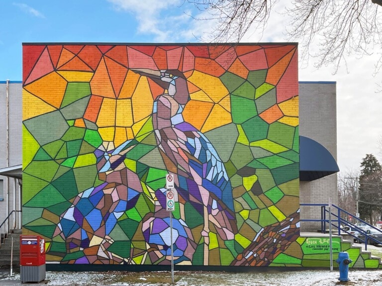
The barriers at Winnipeg’s famous intersection Portage Avenue and Main Street were painted for a project titled “Pulse.” This title refers to what all individuals have in common, no matter their ethnicity or background. The artist took inspiration from those who passed through the intersection, which reminded him of the tradition of weaving. This multi-cultured practice is reflected in the design of the mural in the various diagonal lines.
View Mural →
Graphic mural at the side of Type Books in the Junction. Artist and date unknown.
View Mural →
Working with fabric has been a common theme in my work for the better part of 4 years. In particular, striped folded fabric has been wrapped around my process the most – despite focusing on it for so long it always feels new to me. As I have developed my methods for painting like this, I am able to notice patterns and don’t require a reference photo like I used to. Although there are similarities in the ways that the imagined sheet of fabric folds, it will never be the same as the next time I imagine it to be dropped, folded, wrinkled and smooshed. It is fun to play a game with myself by imagining where the lines are hidden by a crease or overlap and following them from their start to their end. This piece, imagined for the side of Chip’s Vintage, takes up the whole space and doesn’t give any hint to where it starts or ends. We can imagine this sheet of fabric continues beyond the frame of the surface of the mural.
View Mural →
On Untitled Esthetics Studio wall
View Mural →
This was my first trip to Winnipeg and I was pretty charmed by it. It feels a bit like an alternate dimension Edmonton but a bit grungier, a bit more 70s, really rad. I took inspiration from the colours of the buildings and the old school signs here, and that 70s vibe, and made this still life that hints at vintage sci-fi paperback novels. The objects straddle a river, a reference to the black and white piece above with text from Katherena Vermette.
View Mural →
Artist’s Statement: “The Title of the Mural is “”Land in motion””, it is a look at how our landscape is for ever changed around us with the birth and migration to urban landscapes. We don’t have to go far in our province to see these effects. I also wanted to convey some unhealthy qualities that science and humanity bring when creating their world. Some of the Mural traits demonstrate somewhat of a toxicity that is present in the environment, symbolized by the interlacing of the linear patterns, odd geometric shapes and odd colours that form in the skies. This can describe many modern attributes, such as the chemicals in our environment, the noise, the lights… Yet you can also get a sense of a harmony that is unfolding within these same geometric shapes, as we move forward on the landscape. This is most evident when looking at the back of the building, where I’ve painted an aerial view of a cityscape. The wide range of coloured twinkling lights at dusk almost seem magical. This is perhaps one of the positive sides of the illustration, showing the beauty that we can accomplish we connect. It is important for me as an artist to convey a simple message within my work, of negative and positive attributes, to assure that my paintings have a discussion with my viewers and to also leave the viewer open to his or her own interpretations. I am so happy to have had this chance to contribute to the beautifying of our neighbourhood in this way. We have brought a touch of dignity to the area and have set a new path for the future which I believe coincides well with the changes that are occurring in the community.
View Mural →